- You don’t depend on your website as a sales tool
- You have no competitors and a monopoly over your industry
- You’ve already tried responsive design, verified it’s not the right fit for your company, and now use an alternate mobile strategy
If any of these three exceptions apply to your business, then you should be fine. However, if generating leads or sales is a main function of your website and losing that business would be a serious setback, launching a responsive website before the end of the year should be your #1 online marketing goal.

What is a Responsive Website?
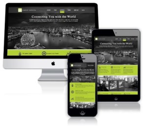
Responsive web design assures that whether visitors are viewing your website on a desktop, tablet, or mobile phone, they are guaranteed the best user experience available. This means alternate versions of your website are available for different screen sizes to facilitate effortless navigation, easy to read text, and fast ways to call or email your business without constant manual resizing and scrolling. Just open up www.snaptech.com on a different type of device while you read this and you will see first-hand how our website “responds” automatically for optimal viewing to your screen size.
Why is a Responsive Website Important for You and Your Business?
In 2014, it is impossible to ignore the volume of internet searches that take place on smartphones. Users are seeking information on the go and are usually looking to take action immediately or in the near future. For some reason there are still many businesses who have not yet capitalized on this trend and the implications it has for their business. Consider the following statistics:
· Global smartphone users will exceed the 2 billion mark by 2015 (Bloomberg)
· By the end of 2014 mobile internet usage is expected to overtake desktop usage. (Huffington Post)
· 25% of Internet users only access the web via a mobile device in the United States. (Huffington Post)
· 25.85% of all emails are opened on mobile phones, with another 10.16 percent being opened on tablets. (Huffington Post)
· 81% of people prefer mobile for its convenience and speed (Vocus Blog)
· 45% of mobile searches are ‘goal-oriented’
· 17% of people make a purchase after a mobile search
When a user has to do extra work on a smartphone to find information, contact your business, or any other type of conversion, do you think that they will still convert as often? This is how responsive design directly helps your business, but there is more to it!

What’s Google’s Take on the Future of Mobile Visitors and Responsive Websites?
When it comes to the web, we all know that Google is a big deal. In fact, Google is the most popular search engine in the world and claimed 67% of global search market share in 2013. Google has also openly stated a preference for responsive websites – something that businesses shouldn’t ignore when it comes to getting relevant traffic to their site.Google became a search engine giant because it is constantly tailoring its services to provide a great user experience. It works with user intent and the most relevant content it can find to offer information that is timely, accurate, and useful – and that’s why so many people use it again and again.
Why does this matter?
Because if you want your site to be preferred by Google and be found above your competition for relevant searches, it has to matter.
Google has announced that it may add mobile user experience to its ranking algorithm in the near future. If your website has a bad mobile experience, it may negatively impact your rankings on Google. If you haven’t already, now is the time to start thinking responsive.
What You Need to Know When Considering a Responsive Website
There are four main areas that you should cover while developing a responsive website:
1. Analysis
Leverage Google Analytics to zero in on the demographics of your current website visitors – paying special attention to device type. Find out just how many people are visiting your site on tablets and smartphones and check to see how the experience differs for mobile users versus desktop visitors based on user statistics. Don’t forget to also evaluate and predict future online opportunities for your business based on current data and trends.
The main goal of this exercise is to use hard data to determine if a responsive website is the right strategy and best move for your business.
2. Strategy
The next step is to develop the right digital strategy for your website and your business. User experience is paramount but futile if your website doesn’t get relevant, engaged visitors. Having the right marketing in place before you develop your website will save you future costs to make your website marketing ready post-launch.
3. Development
Choose a trustworthy developer that understands digital marketing, and is experienced in responsive website programming. Your site should not only be coded in compliance with Google standards but also optimized for search engines from the start.
4. Launch
Before putting your new website live make sure that you don’t lose or jeopardize any existing search engine rankings. Identify and plan strategic redirects that are important for page URLs that might have changed.
Remember, if your company depends on your website as a significant lead generation source, getting a responsive website before the end of the year is key – get it right from the beginning to save money and start getting results as soon as possible.
We are offering you a free website analysis (as described in #1 above) with no obligation to buy.
Simply send us a message or give us a call at 604 677 0742.


