By: Nilo Santiago Sep 11/2024

In online marketing, every element plays a crucial role, from the precise phrasing of your calls-to-action to the strategic arrangement of your website’s layout. However, one critical aspect that is frequently underestimated is the colour scheme. The colours you select for your website, advertisements, and marketing collateral can profoundly impact user behaviour, shaping their perceptions and guiding their actions. This, in turn, can significantly affect your conversion rates, but how can colours influence us?

Colour psychology explores how various colours influence human behaviour, emotions, and perceptions. Each colour has the power to evoke distinct feelings and responses. See the sample below showing what each colour means when working on a brand and marketing project:

A face covering in colourful paints, cropped on the person’s eyes

Among these details, colour is one of the most impactful yet often overlooked elements. The colours you select for your site can shape visitors’ perceptions of your brand, influence their interactions with your content, and ultimately determine whether they take the actions you want—such as making a purchase, signing up for a newsletter, or reaching out for services. This is the essence of colour psychology.

How to Use Colour Psychology in Your Marketing

Here’s what specific colours represent and how they can be leveraged on business websites to boost conversions:

Blue – Building Trust and Reliability

  • Usage: Blue is a popular choice for business websites, especially in industries like finance, technology, and healthcare.
  • Effect: Blue evokes feelings of trust, security, and professionalism. It’s a colour that makes visitors feel safe and confident in doing business with you.
  • Where to Use: Use blue in your website’s header, logo, or background to establish trustworthiness. It’s also effective for buttons like “Learn More” or “Contact Us”.

Green – Promoting Stability and Growth

  • Usage: Green is ideal for businesses in the environmental, health, and wellness sectors.
  • Effect: Green is associated with nature, health, and tranquillity. It’s a reassuring colour that can make users feel comfortable and at ease.
  • Where to Use: Use green for CTAs, particularly those related to sustainability or health, like “Get Started” or “Join Now.” It’s also effective in highlighting key information.

Yellow – Drawing Warning and Conveying Optimism

  • Usage: Yellow is often used in creative industries or for products aimed at younger audiences.
  • Effect: Yellow is bright and attention-grabbing, evoking feelings of optimism and happiness. However, it can also signal caution if overused.
  • Where to Use: Use yellow to highlight promotions or new features. It’s best used sparingly to draw attention without overwhelming the user.

Orange – Encouraging Action and Enthusiasm

  • Usage: Orange is used by businesses that want to convey friendliness and enthusiasm.
  •  Effect: Orange combines the energy of red with the cheerfulness of yellow. It’s a colour that encourages action without being too aggressive.
  • Where to Use: Orange is effective for subscription prompts, discount offers, and CTA buttons like “Sign Up” or “Learn More”.

Red – Creating Urgency and Excitement

  • Usage: Red is often used in e-commerce and promotional websites.
  • Effect: Red is a high-energy colour that grabs attention and creates a sense of urgency. It’s great for motivating quick decisions.
  • Where to Use: Use red for CTA buttons like “Buy Now” or “Limited Offer” to encourage immediate action.
5 Tips to Use Colour Psychology to Improve Conversions 1) Understand Your Audience: Before selecting a colour scheme, it's important to consider the preferences and cultural backgrounds of your target audience. Different groups may have varied reactions to specific colours. 2) Optimize and Test: A/B testing is crucial when it comes to colour choices. Test different colour combinations to see which ones yield the highest conversion rates. What works for one brand may not work for another. 3) Use Contrast: High-contrast colour schemes can make important elements like calls-to-action stand out. Ensure that your text is easily readable against your background colours. 4) Keep Your Brand Cohesive: Your colour scheme should align with your brand's identity. If your brand is associated with calm and reliability, sticking to blues and greens might be more effective than using bright, bold colours. 5) Avoid Overcomplicating It: While colour is important, too many colours can be overwhelming and distracting. Stick to a cohesive colour palette that complements your brand and enhances user experience.

Black – Strength and Sophistication

Usage: Black is frequently used by businesses that aim to project power, elegance, and modernity.

Effect: Black is a colour that represents authority, sophistication, and timelessness, often adding a sense of exclusivity.

Where to Use: Black is ideal for luxury brand logos, high-end product pages, or sleek, modern website designs. It’s also effective for bold CTA buttons like “Shop Now” or “Exclusive Offer”.

White – Simplicity and Purity

Usage: White is often chosen by businesses that want to emphasize simplicity, cleanliness, and openness.

Effect: White conveys purity, clarity, and minimalism, creating a sense of space and freedom.

Where to Use: White is perfect for backgrounds, whitespace, or minimalist designs that focus on readability and clarity. It’s also suitable for CTA buttons like “Learn More” or “Start Now” to create a clean, straightforward approach.

Pink – Nurturing and Playful

  • Usage: Pink is often used by businesses aiming to convey warmth, nurturing, and a playful atmosphere.
  • Effect: Pink blends the passion of red with the calmness of white, creating a colour that evokes feelings of care, compassion, and light-heartedness.
  • Where to Use: Pink works well for brands targeting a youthful or feminine audience, and is ideal for product pages, customer testimonials, and call-to-action buttons like “Get Started” or “Join Us”.

Purple – Creativity and Luxury

Usage: Purple is commonly used by businesses that want to communicate creativity, luxury, and sophistication.

Effect: Purple combines the stability of blue and the energy of red, often evoking a sense of mystery, elegance, and high quality.

Where to Use: Purple is effective for highlighting premium products, luxury services, or creative endeavours, and works well in headers, product descriptions, and call-to-action buttons like “Discover More” or “Explore Our Collection”.
5 Tips to Use Colour Psychology to Improve Conversions

  1. Understand Your Audience: Before selecting a colour scheme, it’s important to consider the preferences and cultural backgrounds of your target audience. Different groups may have varied reactions to specific colours.
  2. Optimize and Test: A/B testing is crucial when it comes to colour choices. Test different colour combinations to see which ones yield the highest conversion rates. What works for one brand may not work for another.
  3. Use Contrast: High-contrast colour schemes can make important elements like calls-to-action stand out. Ensure that your text is easily readable against your background colours.
  4. Keep Your Brand Cohesive: Your colour scheme should align with your brand’s identity. If your brand is associated with calm and reliability, sticking to blues and greens might be more effective than using bright, bold colours.
  5. Avoid Overcomplicating It: While colour is important, too many colours can be overwhelming and distracting. Stick to a cohesive colour palette that complements your brand and enhances user experience.
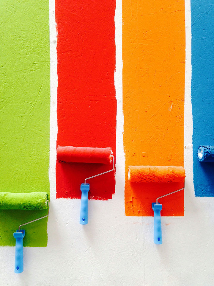
Four paint rollers and paint lines in green, red, orange, and blue

Tool Tip: Several tools on the internet might help you find the best colour wheel for your project. Adobe Color is a great starting point.

Accessibility Tip: For maximum accessibility, especially for those with colour blindness, create a colour blind-friendly palette using basic hues and avoiding combining red and green. Learn more here.

Increase Conversions with Colour Psychology

Colour psychology is a powerful tool that can significantly influence user behaviour and conversion rates on your business’ website. If you’re looking to optimize your website’s colour scheme or any other aspect of your marketing strategy, Snaptech Marketing is here to assist you. Our team of experts can help you create a more engaging and effective online presence, driving better results for your business.

Contact us today to discuss how we can support your next project.